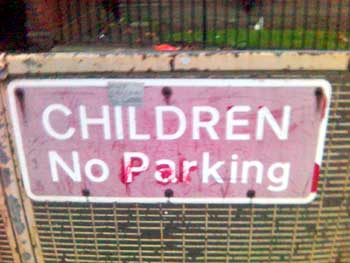
Lovely example of bad interaction design – I was walking past some flats yesterday and happened across the below.
Brought some wonderful images to mind of children parking cars and the emergency services having to pay and display round the corner to attend an incident.
It may obvious what the message is meant to be although is this more to do with the fact we are used to poorly laid out public messaging or simply that within the context our brains are able to think a little more laterally.
Note: I believe the design of the original UK road signs to be excellent. But as with many systems, increasing complexity does not necessarily increase understanding.